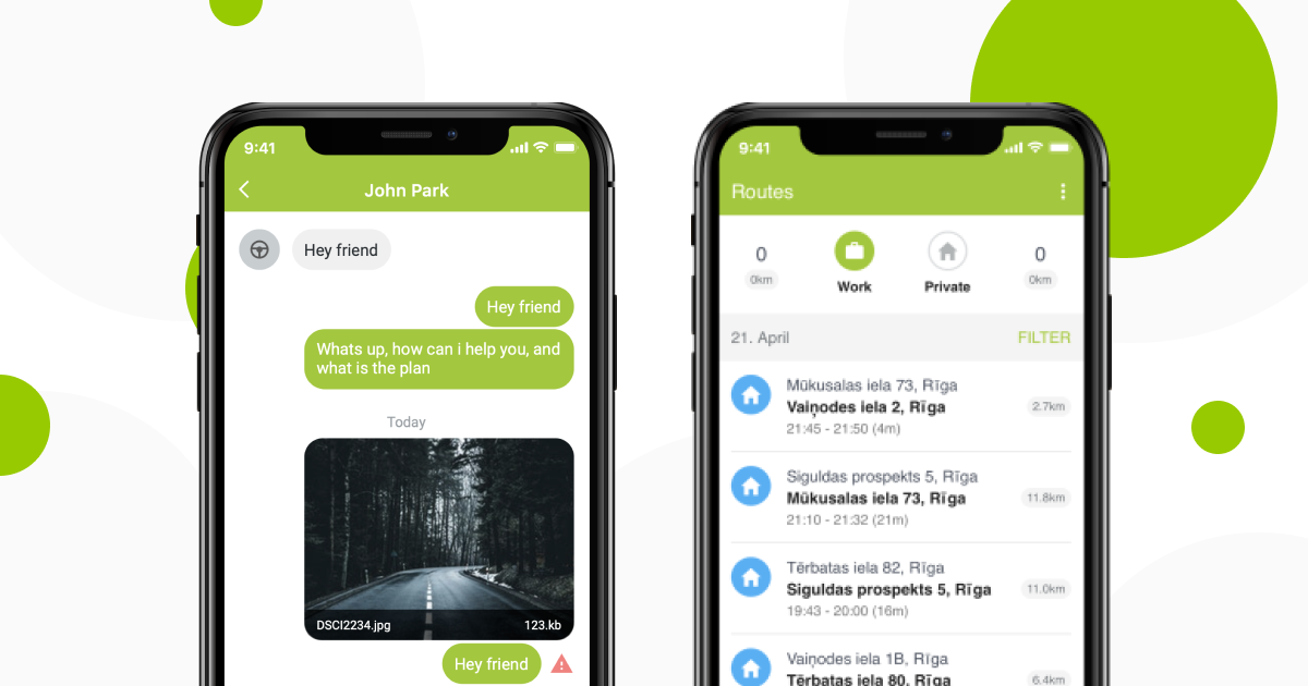
Mapon has been working hard on supplementing our already highly functional and ergonomic Mapon application, and we’re proud to announce that it has been improved even more.
We have now added a reports section which you can filter according to dates. You can pick as little as a day or as much as a month and see the distance each of your drivers has driven using which vehicle, how much fuel has been spent and how much time has been spent driving and without moving.

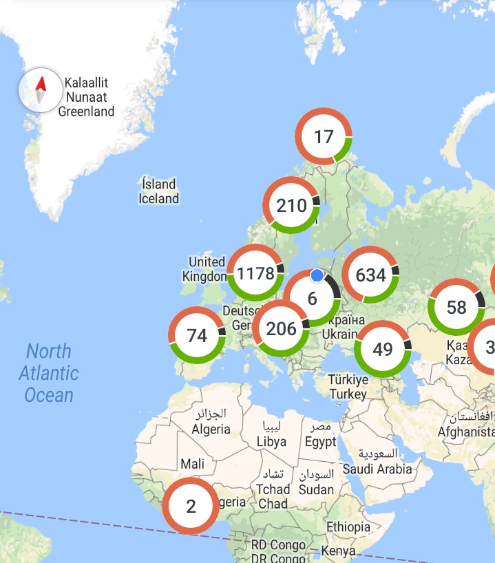
Furthermore, our map view now has circle icons that show – according to a corresponding colour – the amount of cars that are moving and aren’t. It’s simple – the ones that are driving correspond to the green colour, the ones that aren’t – red. Black indicates data that isn’t available.

