Mapon System’s New Design – Insight in the process towards a more convenient system!
As you might have guessed from the title – we are working on a brand new design for Mapon system.
As time has passed, our system has become a bit old-fashioned. We know that you are used to it and you like it as it is now, but there is always a room for improvement. The comfort of old system can be misleading and we believe that it is time to upgrade the design of our system.
But don’t worry:
Nothing should be changed without decent planning, research and goal setting, therefore we have done lots of work in the past months to deliver the best product:
- We explored the system ourselves from different perspectives taking a critical look even at the deepest sections and most complicated functions.
- We kept in mind all the main sections and made sure that no functionality is lost or moved to a new section causing inconveniences due to these interface design changes.
- We identified the main problems and developed a roadmap to re-design strategy.
- We decided to do a gradual re-design launch; to make it easier for you to transfer to the new user interface and bring you the best user experience.
- We started working on navigation menus and outer interface elements, leaving the main content the same for now (however, the work continues and we are already working on all other sections as well).
We have also thought about you:
You are the ones who use our system the most, and we understand how important it is to listen to the clients, therefore we are giving you a sneak peak into our system, and you can also fill in the survey to tell us what you think about this upcoming update and share some feedback. We would love to hear from you.
The goal of the system re-design is to:
- Make it user-friendlier and more convenient to use.
- Improve system’s performance (speed) and stability (companies with larger fleets will notice the biggest difference).
- Make it fresher and more pleasant.
- Make it more scalable so that we could add new and innovative solutions to our clients, such as fleet maintenance (read more about our upcoming product update here)
And here is the part you probably want to see the most:
A sneak peak into the new design.
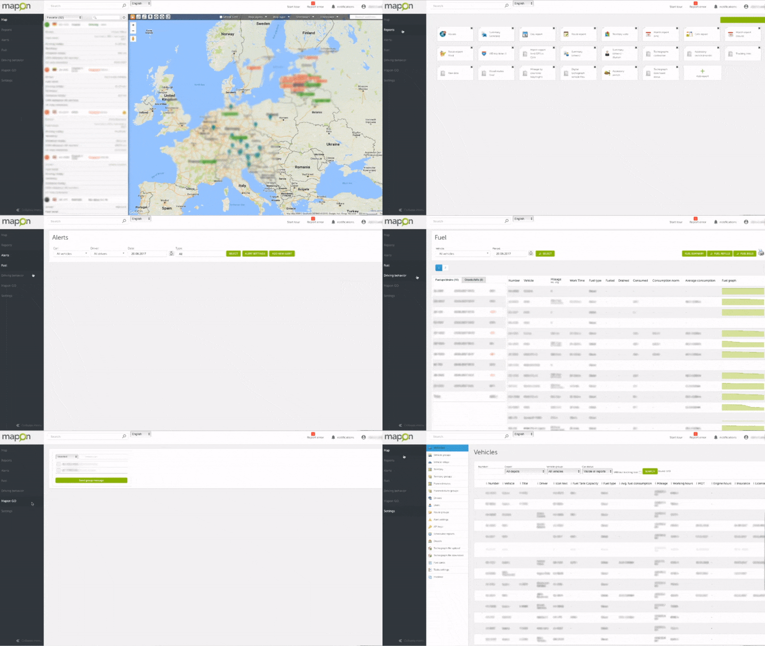
The new design

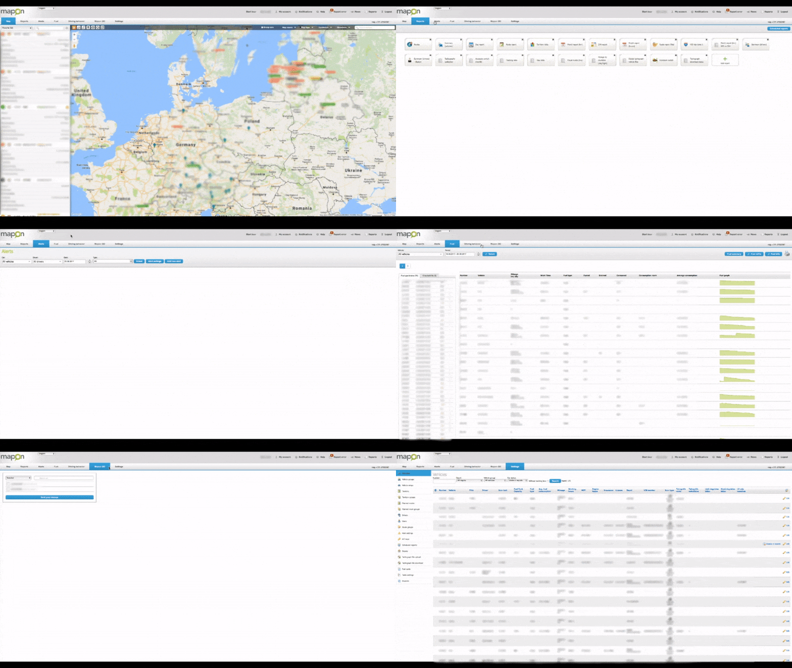
Current version

As you can see in comparison GIFs – the main navigation menu has moved to the left side and can be minimised to offer bigger screen field for important functions, maps and charts. The whole system will be slowly re-designed so it would be in one style. This has been on our to-do list for quite some time now, and we are happy that we are moving closer to delivering a modern and more flexible system to our partners and clients.


